
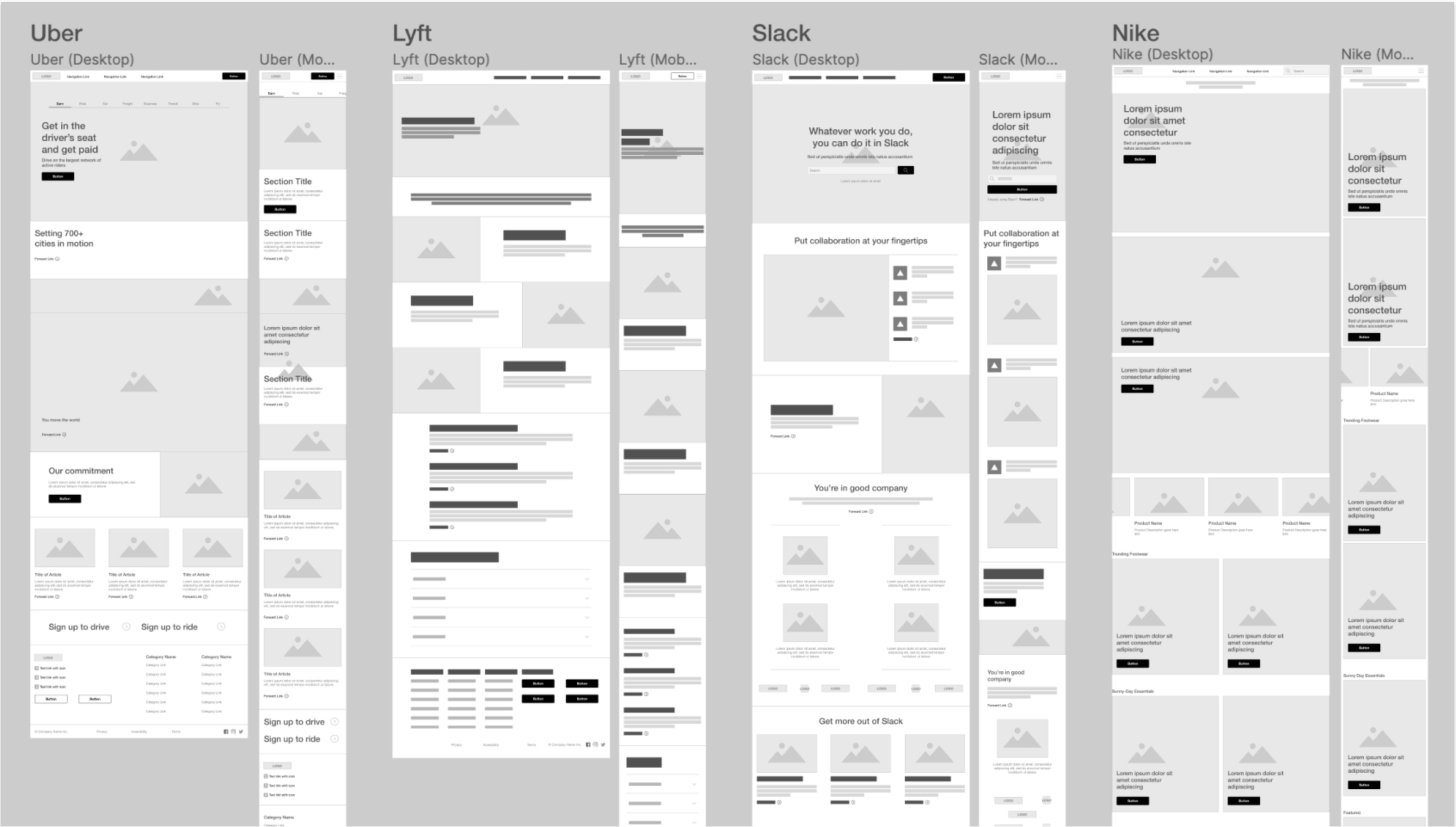
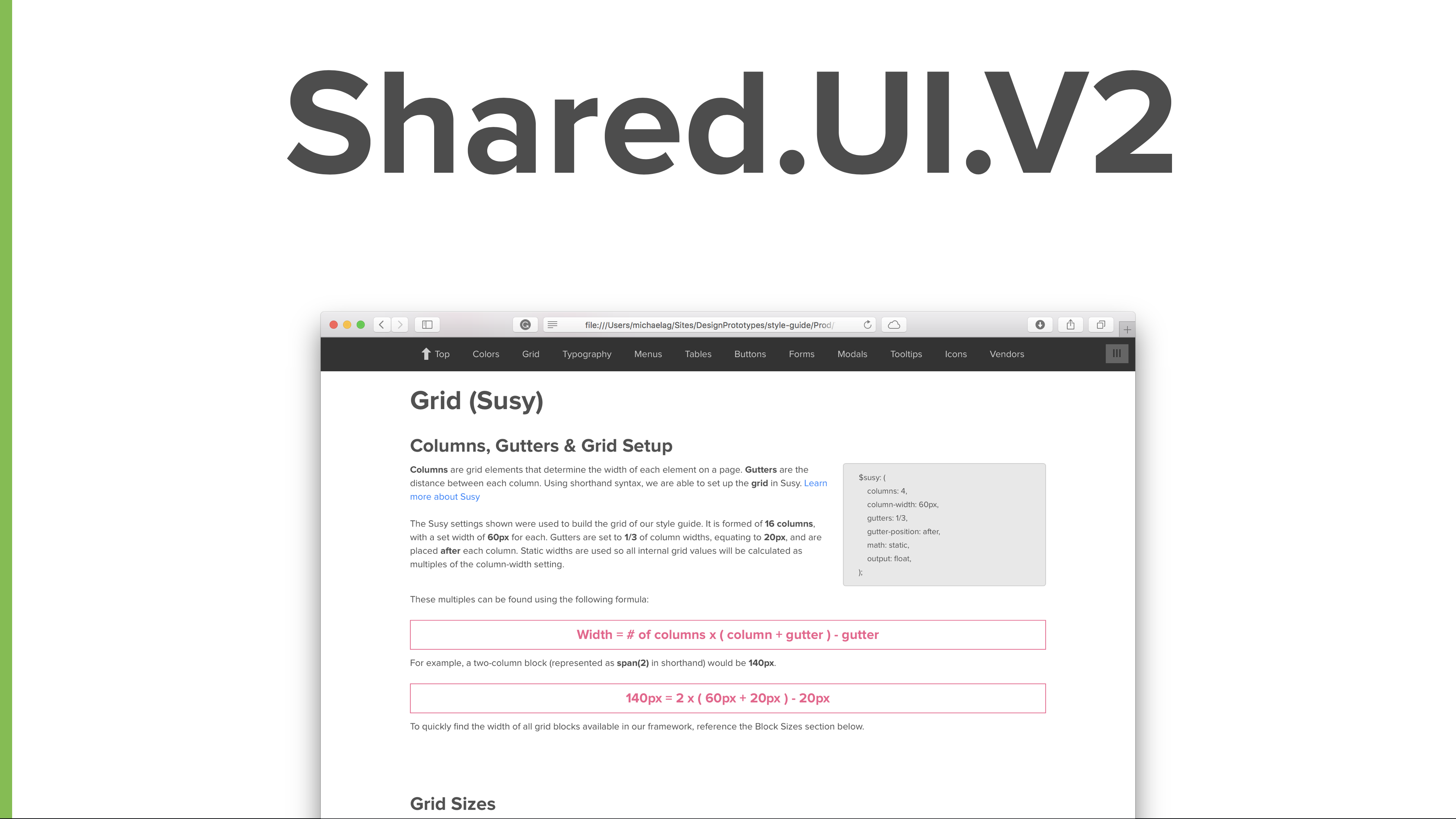
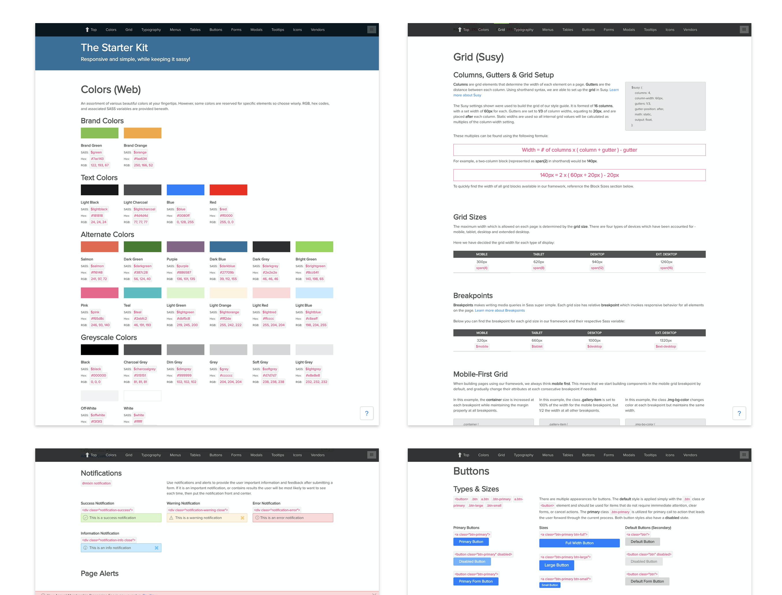
Herbalife's Suite of digital products empowered coaches to manage personal sales, customer relations, personal and customer fitness on both web and mobile. The digital products were supported by 12 vertical teams, and even though there was a shared style guide, front UXUI and backend development patterns differed between teams.
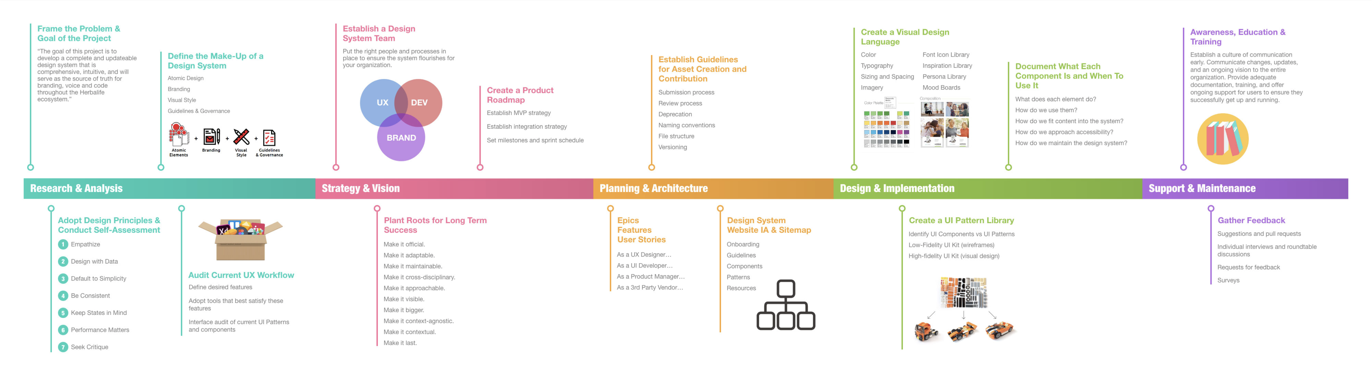
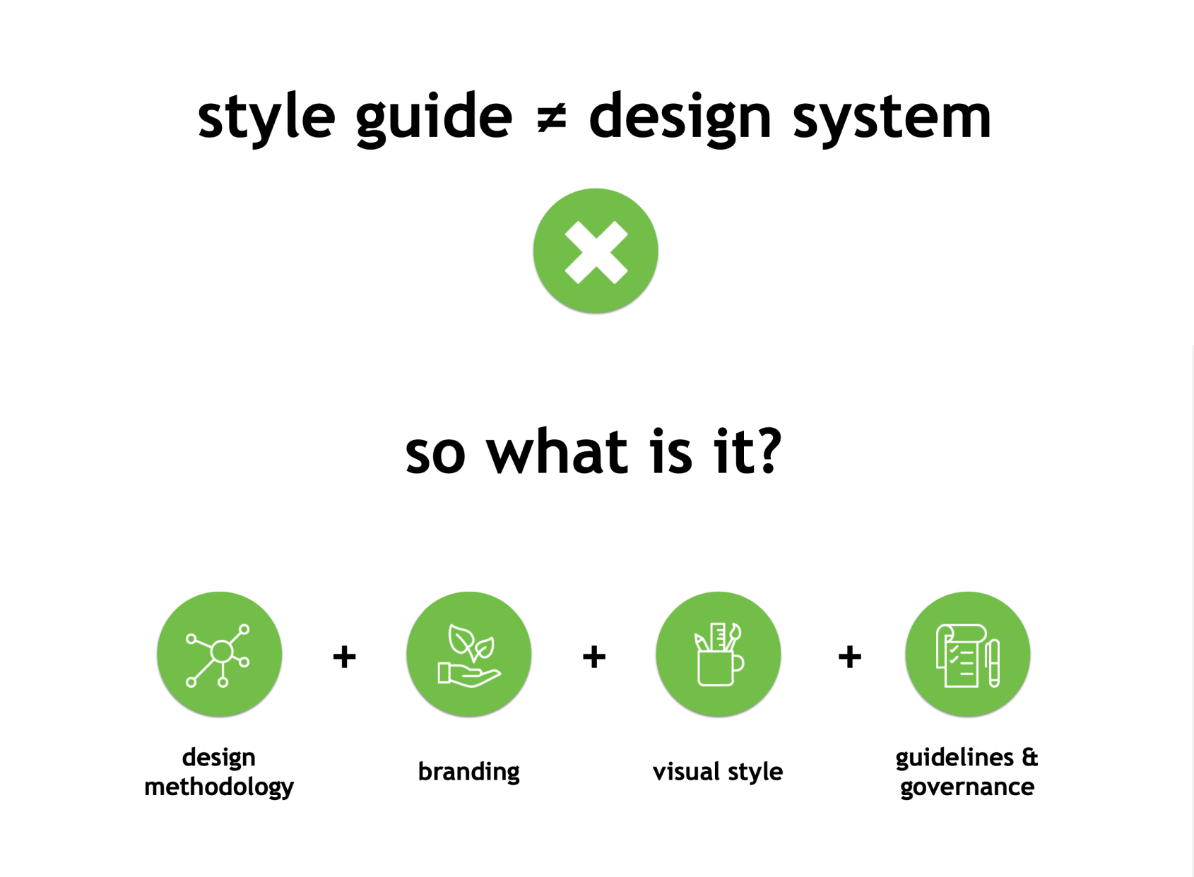
Together we worked to inventory, audit current design and development pattern in order to create a shared design system that could be used across all products and teams.
Design Manager
Individual contributor
MyHerbalife Root
Signup & Shop
Reports
Support Center
ClubFitness
Weight Loss Challenge CRMRegional CMS
myClub
HLConnect
6 Months (cont)
2017
There was a lack of constant front end UXUI and backend development patterns results in an inefficient (un-agile-like) design and development process creating inconstant unscalable design patterns and end user experiences.
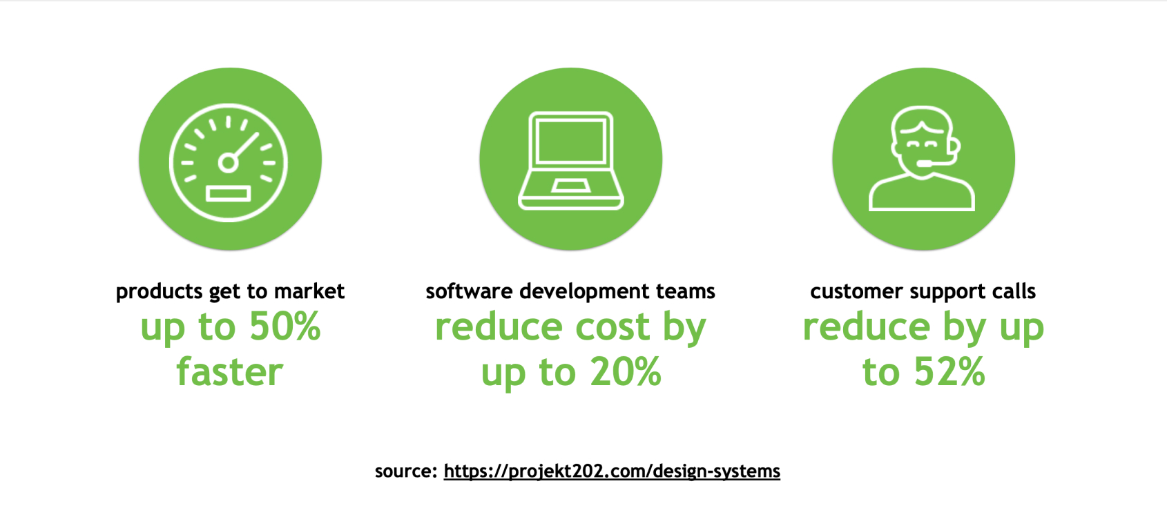
Decide how best to support a design system initiative between 12 verticals. To understand what UI elements and development practices were shared between digital products. Consolidate these patterns and create a new digital platform for all current and future products to be build with and on. Create a support system that would regularly educate teams on best practices and define a process for updating and improving the design system over time.
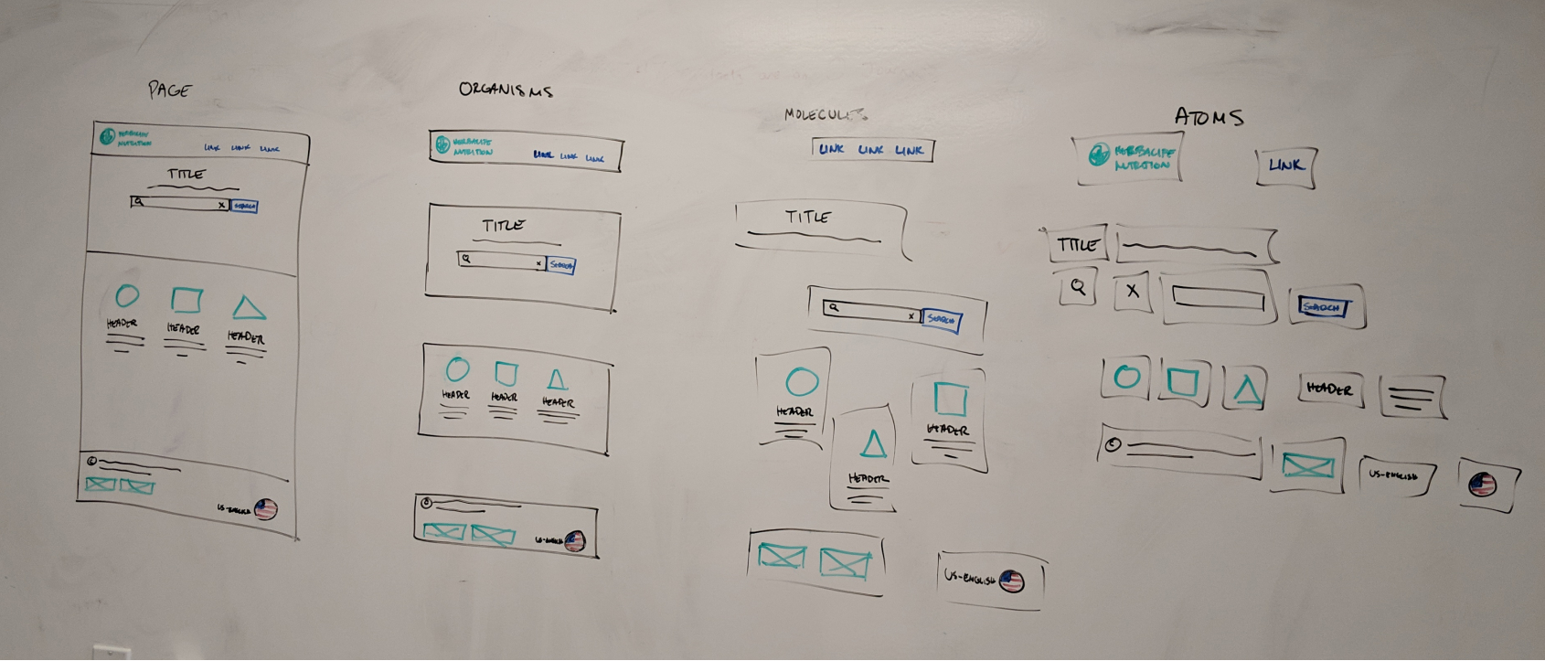
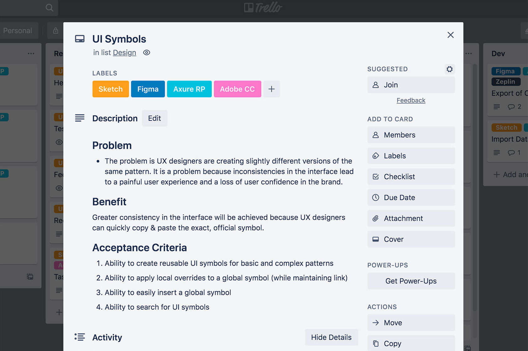
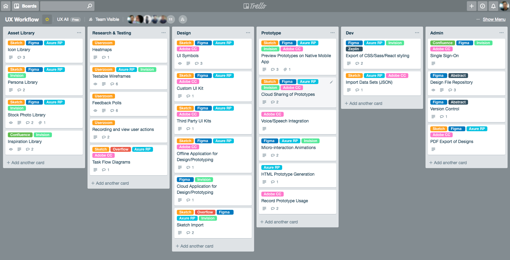
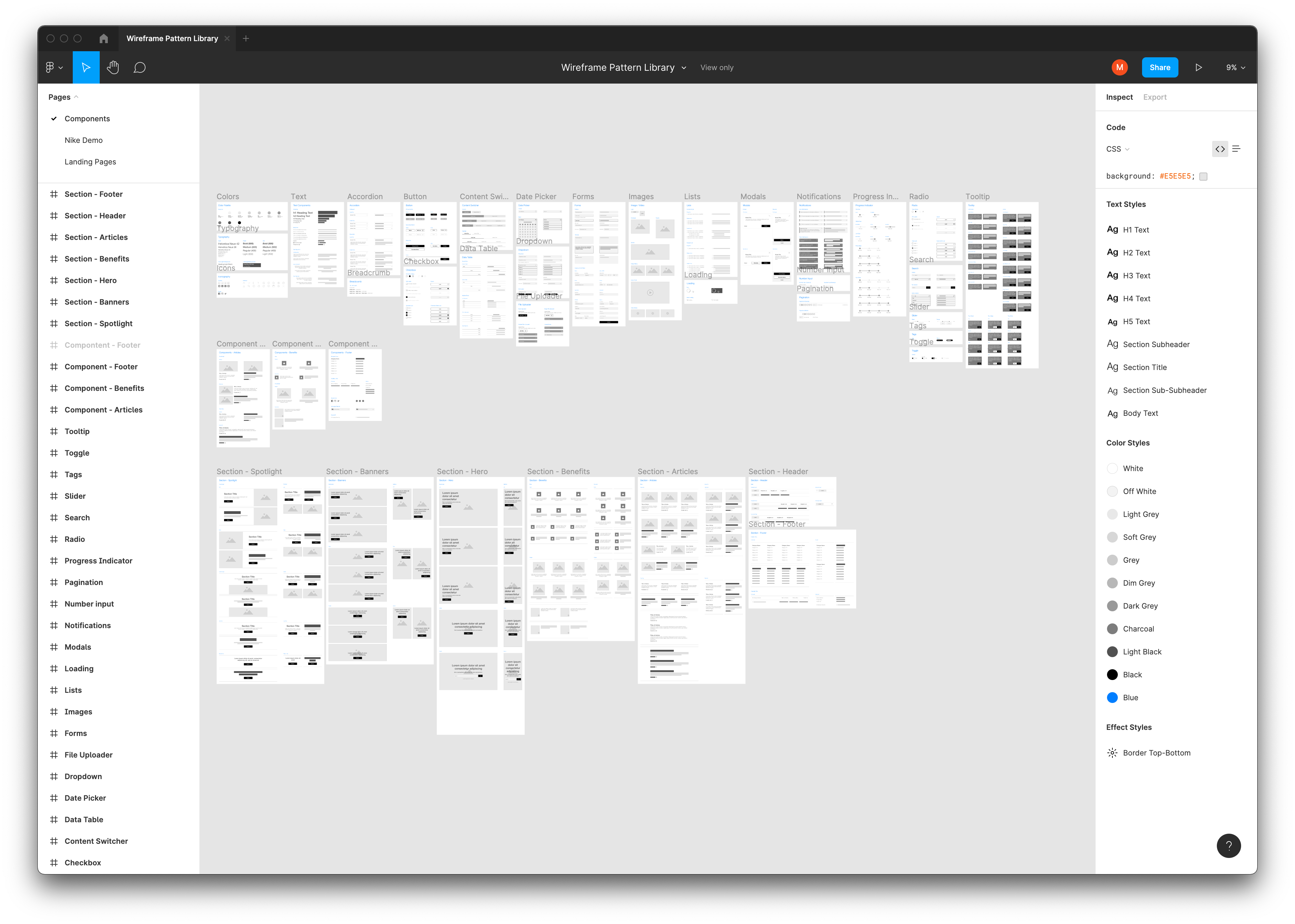
Research design system best practices and tools, Inventory every designed and development ui elements, Audit design and development patterns and group into categories, Edit naming conventions, organization and categories creating a constant design language. Create a system to update and improve the design system over time.
Web and mobile design system, UI pattern library, documented use implementation and use cases, define update and support process.
Working as a federated support team of design, product and development leads we created a cross product shared design system and update and education process.
" Why is signing up so hard? This should be easy."
- a goHerbalife customer
UX teams can flourish with style guides and pattern libraries, but a design system is a clear indication of maturity across an organization. It requires ongoing collaboration between UX, Brand, and Development teams which can be challenging, but ultimately gives us the framework to build it better.

We created the roadmap above to help all stakeholders visualize what is needed to create a design system. It's essential that all teams understand that a style guide ≠ design system. A design system is composed of a design methodology, branding, visual design, guidelines and governance. It's a set of reusable components that can be brought together to create any number of applications within the same ecosystem.

The hardest part of adopting a design system is getting buy-in from the extended team, senior management, and executives. It's important to keep the audience in mind when talking about ROI and business value. Functional teams want to see products get to market faster. Developers want to see reduced cost and re-work. QA and support teams want to see automation and reduced calls. Fortunately design systems deliver all of these and more.

While it is sometimes daunting to secure an invenstment from leadership for this effort, it does not mean that you can't get started with your team. As we create designs in low-fidelity for our digital products, we make sure to add potentially reusable components to our Design System. Adopting this federated approach has helped us get started without the need of a core team and budget. Re-usable components created through various products can be leveraged by any team memember to quickly create design concepts that can be used in their own projects.

Though a series of presentations and demos we shared the value of a design system with our product teams and Sr. leadership. It was a hard sell at first, as often with change comes resistance and several product leads were fearful of adding additional work to their already stacked product backlog.

After a couple weeks of discussion the initiative was approved! Working together we created a proposed budget to be shared across products and a timeline and plan for everyone to align behind.
First step was to align our team around common tools. We knew for this to be successful we'd need to have a single shared source of truth for all components and design elements. It's natural for UX designers to want to work with tools that best suit their personal needs, but a lack of standardization of team workflow will hurt productivity in the long run. In discussions with our team, we've had plenty of back-and-forth on which tools are best for design, prototyping and testing. Should we base our decision on features or tasks? Should we use an all-in-one tool or combination of tools that compliment each other? For any one of the tools in consideration, it was easy to find an article or video that said "XYZ is the winner".
To put this debate to rest, we had to come together as a team and documented which features were most important to us, nice to haves, and pie-in-the-sky. We treated this exercise just like any other project, identifying pain points, the benefit of having this feature, and acceptance criteria for what would satisfy our needs.

Once we completed defining all the features, we were able to tag each one with labels that represented tools in consideration. Filtering by label allowed us to easily visualize how much each tool covered, or what combination of tools gave us the best coverage.

In the end our team decided on Confluence + Figma + Zeplin. Having team members in different geographical locations, we felt that Figma was the best choice as it is known for its highly collaborative features. Files are stored in the cloud, team libraries ensure consistency across projects, and it even has a "multiplayer mode" for working on projects simultaneously in real-time. Lastly, we wanted to make sure developers could easily translate our prototypes to code so Figma's inspect mode for developer handoff coupled with the Zeplin plugin for React Native code seemed like the best fit.
Linking with individual team product managers we assigned team design and development leads from each vertical along our value streams. Each responsible to performing an extensive inventory of what design elements, components are currently used.

As with everything collaboration is key, above you can see us gathering a list of what common use case and pattern we have across each digital product.

We found around 60% of the products team work still followed the Shared UI guidelines, one of my first contributions when joining the team. However none of only two vertical teams used a constant process or practice when developing. Meaning that their design elements we unusable across platforms and therefor if a new design pattern was transferred it would have to be built custom each time.

Inventoring the UI elements was a rigorous task, but by the end we had a clear idea of where gaps in the pattern library lay and where we need to focus. The biggest challenge was cleaning up naming conventions, capturing states and idenifying clear atomic elements.
Inventory's done, time to design and define and share.
Working together we created Figma file of all available ui elements and components, giving examples of variants, features, considerations ( dimensions character length etc ) and current update process and usage.

We used confluence as an all-in-one workspace solution. It provided an exellent way to record and share our design system with the entire team in order to solicit feedback and promote collaboration.
Taking a federated approach, the leads meet once a week to discuss any new elements made that should be considered to be added to the design system. We also spend this time to discuss rollout cadence of new updates and versions while gathering overall feedback on how we can continually improve the space in confluence and Figma to better service all teams.
Oh and we gave our new design system the loving name Hamster-Cool

As we made progress and solidified the overall process we worked together to educate all team members on best practices and engagement guidelines through extensive presentations and feedback sessions. Adding continues improvement to every product backlog , emphasiing that the work is never final and always improving.
Building a design system was rigorous, but we succeed thanks to incredible collaboration. Involving stakholders throughout the development of Hamster cool was a priority and continues to be. Thanks to a our self organizing teams through design, functional, development we accomplished what at the beginning seemed impossible but in the end completely doable.